 I just paused from my internet life, and saw a commercial on Ovation TV for what looks to be an awesome series called "American Revolutionaries." They will be featuring some great musicians, from Sarah Vaughn to Chuck Berry (hence the name of this post). Not only does the series look good, I love their graphics! The saturated illustration on top of the black and white photo and the great use of type, its love all over. To check out a schedule of the American Revoluntionaries series, click here.
Showing posts with label Great Design. Show all posts
Showing posts with label Great Design. Show all posts
Thursday, July 9, 2009
Maybellene
I just paused from my internet life, and saw a commercial on Ovation TV for what looks to be an awesome series called "American Revolutionaries." They will be featuring some great musicians, from Sarah Vaughn to Chuck Berry (hence the name of this post). Not only does the series look good, I love their graphics! The saturated illustration on top of the black and white photo and the great use of type, its love all over. To check out a schedule of the American Revoluntionaries series, click here. Wednesday, January 28, 2009
Take a Piece of my Type
 Found this while purusing the internets today. The website, Type is Art, allows you to take pieces of typography and transform them into a little piece of art. Above is a little sampling of mine. Enjoy!
Monday, January 26, 2009
Rubik's Cube
Time for a little inspiration Monday! I've loved Joe McLaren's illustration style on flickr for some time now. The colors and the way he uses shapes is awesome.

Friday, January 23, 2009
Fun Friday-For all the A-holes out there!
This is too great! Everybody needs a little designer comedy now and then! Happy Weekend!

Thursday, January 22, 2009
Logo Work

At my internship I've been busy working away at some new logos. So far I'm leaning to the first two there, but we'll see which one ends up being used :)
Awesome Type Coin

 Graphic Design Wednesday---A Little Late
Stani Michiels, architect and artist recently won a design competition for the Dutch Ministry of Finance for the new 5 Euro coin. The theme, "Netherlands and Architecture," inspired him to create the coin using Architect's names to create a portrait of the Dutch queen on the front of the coin, while the back uses a variety of Architecture books to create an outline of the Netherlands. He says on his blog, “The books rise as buildings towards the center. Through their careful placement they combine to outline the Netherlands, while birds’ silhouettes suggest the capitals of all the provinces."
“I approached the subject ‘Netherlands and Architecture’ from two points of view,” he says on his blog. “On one hand I paid tribute to the rich Dutch architecture history and on the other hand to the contemporary quality of Dutch architecture. These form also the two sides of my coin. Traditionally the front of the coin needs to portray the queen, while the back side displays the value of the coin.”
Thanks to Creative Review for the link
Friday, January 9, 2009
When Your a Jet....Snap, Snap, Snap
Thursday, January 8, 2009
For the Love of Posters
On January 15th, Steve Walters of Screwball Press will be giving a demonstration and presentation about his screenprinted posters at Grand View University. His show looks awesome in the gallery and I'm way excited about going. Rumor is, if you go, you get a free poster :)

Thursday, October 2, 2008
Quick post of a great find!
I'm in love with this stamp. I may have to buy some just to make my letters (aka bills) prettier :) They are very Jim Flora inspired. He illustrated albums covers and children's books in the 40's, 50's and 60's.
Here is what the USPS website said about this stamp:
"On September 8, 2008, in Washington, DC, the Postal Service™ issued a 42–cent, Latin Jazz commemorative stamp.With the issuance of the Latin Jazz stamp, the United States Postal Service® celebrates the rich musical heritage of the United States of America. The stamp features a bold, graphic design by San Francisco–based artist and Latin jazz fan Michael Bartalos of San Francisco, California. The design conveys the multicultural aspects of the music, its percussive and improvisational nature, and its rhythmic complexity"

Thursday, September 25, 2008
BEST bookbinding team featured on Etsy!
Tuesday, September 16, 2008
Busy Busy and New Design
So I've been awful about posting lately. School has been taking priority thus far and I've also been dealing with personal things as well. Just recently went home to help my family move to the new house. Kind of sad to pack up from the only home I've lived in, but somewhat exciting to move into a new place.
Even though I've been busy, I took some time tonight to go to my friend Lacee's Mary Kay party. I've been using Mary Kay since I started wearing make-up (I won a free make over). They recently changed the design of their compacts and I was blown away with the design. My old compact was obviously a few designs ago. The new design is sleek and modern and I love how they used the pink. I ended up spending probably more than I needed to, but it was a fun time. 

Wednesday, September 3, 2008
I'm Published!


Well kind of.....how to you describe it when somebody uses your design? Anyway, one of my logos was used and I just got to see the pictures! Yeay exciting! Hope you enjoy :)
Tuesday, August 19, 2008
When I grow up...
 I want to be like this girl! This print is from Elizabeth House and I stumbled upon her blog and love her stuff! She's into printmaking and bookbinding and also is a new fabric designer! Maybe when I grow up I can be a fabric designer too (or just be printing and bookbinding in my "studio" aka the basement :)
Monday, August 18, 2008
Fall done by Etsy
I've been thinking more and more about fall lately, probably due to the mild August we've been having. As I've thinking about fall, I've been looking at some finds on Etsy that my fall spirit is pining for :)
First is the great shawl by TickedPinkKnits:


And everybody needs a little vintage inspired art hanging around :) Great little print from monkeypowered
 So much stuff to look forward to fall with :)
Thursday, July 24, 2008
It's Done.....
...well not quite, but it's getting close! The newsletter that is. I've been working on this newsletter for school. Basically it's trying to sell the art department to high schoolers. I had a really hard time trying to get the design down, for some reason. I think my main problem was trying to create a great design, while still trying to appeal to high schoolers. I'm not that far removed from high school, but looking back, it feels so far away.

 I've definately got some more tweaking to do, but I think I'm on the right track now. Tonight I'm going to try and finish up the tweaking and hopefully have time for some other projects I'm working on...more on that later :)
I've definately got some more tweaking to do, but I think I'm on the right track now. Tonight I'm going to try and finish up the tweaking and hopefully have time for some other projects I'm working on...more on that later :)
Saturday, July 12, 2008
Thank You Mr. Flora
Last week my boyfriend and I were shopping downtown and happened to walk by this poster in a store window. Now being a graphic designer, I happen to like to look at the poster more for the design than anything else, and when I saw this poster I immediately wanted to find out where I could get one. Unfortunately I couldn't find a place to get one, nor could I find a pic of it online.
The main reason I fell in love with this poster was because of its obvious Jim Flora influence. For those that don't know Jim Flora's work, he was an illustrator and designer in the 40's and 50's and illustrated for RCA and Columbia records. His primary focus was on jazz albums and his work was influential to many of today's designers like Tim Biskup.
Luckily I have a few of his album covers and I hope to get the books of his work (The Curiously Sinister Art of Jim Flora and the Mischievous Art of Jim Flora).
 Here is the schedule for the Jazz in July Festival (hopefully I can get a copy of the poster soon and post it here!)

And here is the Jim Flora album cover that I think gave the most influence to the Jazz in July series. Please take a minute or two to check out his awesome work at http://www.jimflora.com/ or check out the blog about his work at http://jimflora.blogspot.com.
The main reason I fell in love with this poster was because of its obvious Jim Flora influence. For those that don't know Jim Flora's work, he was an illustrator and designer in the 40's and 50's and illustrated for RCA and Columbia records. His primary focus was on jazz albums and his work was influential to many of today's designers like Tim Biskup.
Luckily I have a few of his album covers and I hope to get the books of his work (The Curiously Sinister Art of Jim Flora and the Mischievous Art of Jim Flora).
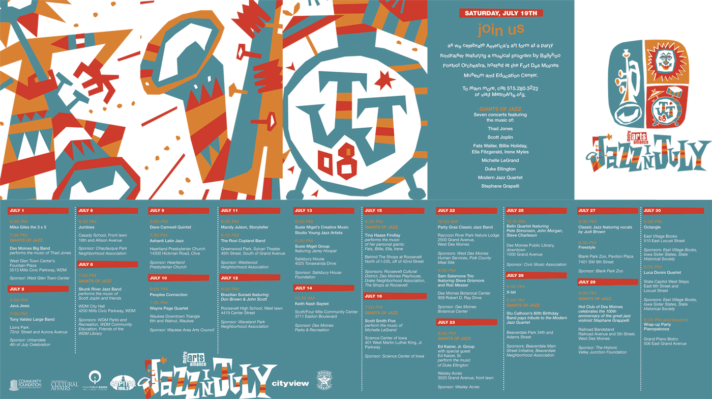 Here is the schedule for the Jazz in July Festival (hopefully I can get a copy of the poster soon and post it here!)
And here is the Jim Flora album cover that I think gave the most influence to the Jazz in July series. Please take a minute or two to check out his awesome work at http://www.jimflora.com/ or check out the blog about his work at http://jimflora.blogspot.com.
Subscribe to:
Posts (Atom)

